A long argument that had to stay readable.
An acquisition and sales engine for car dealers. The product is complicated, the buyer is skeptical, and the page had to carry 10 screens of reasoning without losing anybody in the third one.
strykeauto.com ↗
Software
Long-form
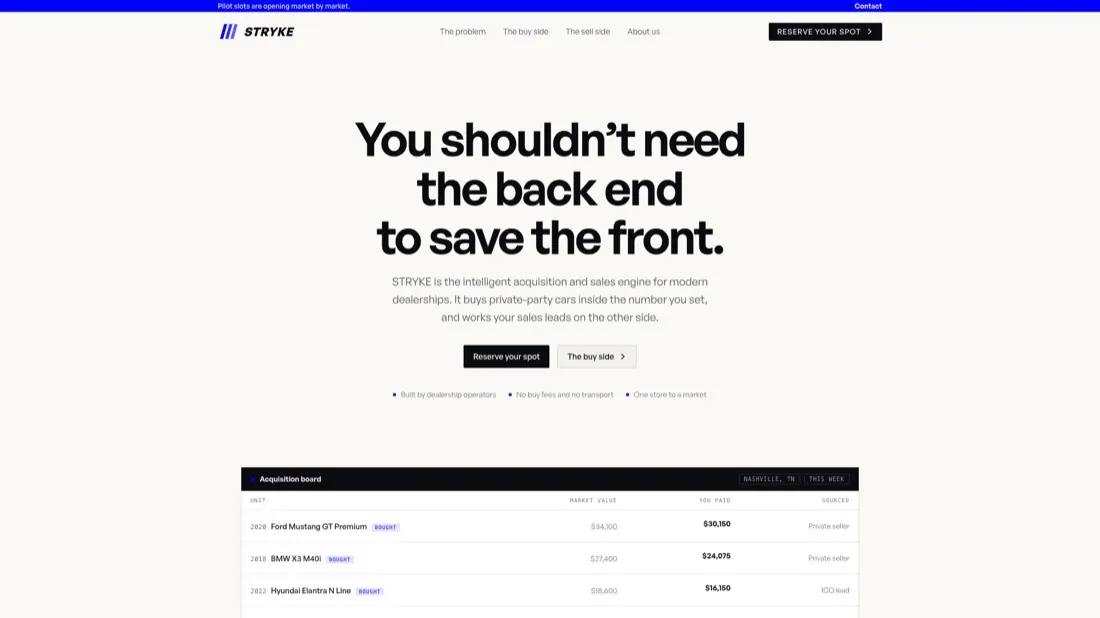

Desktop and phone. 10 screens of argument still read on a phone because each section makes a single claim.
The problem
Dealers get sold to constantly and have heard every promise. A short page would have read as another pitch. A long page risked being abandoned. The job was to make length feel like substance instead of padding.
What we did
- A thesis in the first screen. One sentence that names the problem in the buyer's own language before any feature appears.
- Electric indigo against off-white. One saturated color, used on the mark and the primary action and almost nowhere else, so it always means something.
- An italic wordmark with a striped mark that reads at 16 pixels in a nav bar and at 100 on a banner.
- Sectioned reasoning. The buy side and the sell side argued separately, so a reader who only cares about one can skip the other without feeling they missed something.
10 screens is fine. 10 screens that repeat themselves isn't.